2. Checkbox

2
3
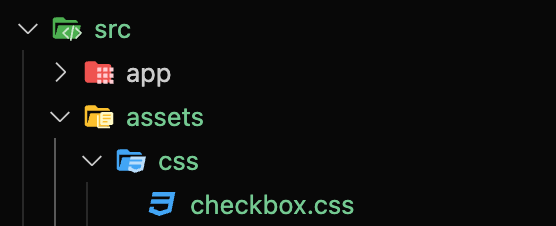
3) CSS 파일 분리 및 import

@import url('../assets/css/checkbox.css');@tailwind base;
@tailwind components;
@tailwind utilities;
@layer base {
input {
@apply appearance-none;
}
}
@layer components {
.checkbox {
@apply mx-2 inline-block h-6 w-6 shrink-0 cursor-pointer bg-icon-checkbox bg-contain bg-center bg-no-repeat align-middle checked:bg-icon-checkbox-on disabled:bg-icon-checkbox-dis;
}
}5) 컴포넌트 내 사용 예시
const CheckBox = () => {
return (
<div className="inline-flex gap-4 rounded-lg border border-gray-400 bg-white p-8">
<div>
<input className="checkbox" id="chk1" type="checkbox" />
<label htmlFor="chk1">label</label>
</div>
<div>
<input className="checkbox" id="chk2" type="checkbox" disabled={true} />
<label htmlFor="chk2">disabled</label>
</div>
</div>
);
};
export default CheckBox;4
6) 결과
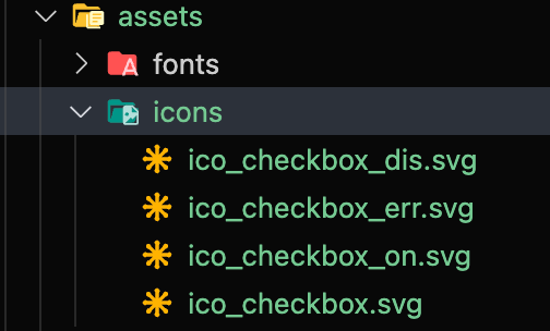
local icons
config
theme: {
extend: {
backgroundImage: {
'icon-checkbox': "url('~/src/assets/icons/ico_checkbox.svg')",
'icon-checkbox-on': "url('~/src/assets/icons/ico_checkbox_on.svg')",
'icon-checkbox-dis': "url('~/src/assets/icons/ico_checkbox_dis.svg')",
},css
@tailwind base;
@tailwind components;
@tailwind utilities;

@layer base {
  input {
    @apply appearance-none;
  }
}

@layer components {
  .checkbox {
    @apply mx-2 inline-block h-6 w-6 shrink-0 cursor-pointer bg-icon-checkbox bg-contain bg-center bg-no-repeat align-middle checked:bg-icon-checkbox-on disabled:bg-icon-checkbox-dis;
  }
}component내에서 사용 예시
const CheckBox = () => {
  return (
    <div className="inline-flex gap-4 rounded-lg border border-gray-400 bg-white p-8">
      <div>
        <input className="checkbox" id="chk1" type="checkbox" />
        <label htmlFor="chk1">label</label>
      </div>
      <div>
        <input className="checkbox" id="chk2" type="checkbox" disabled={true} />
        <label htmlFor="chk2">disabled</label>
      </div>
    </div>
  );
};

export default CheckBox;결과

마지막 업데이트